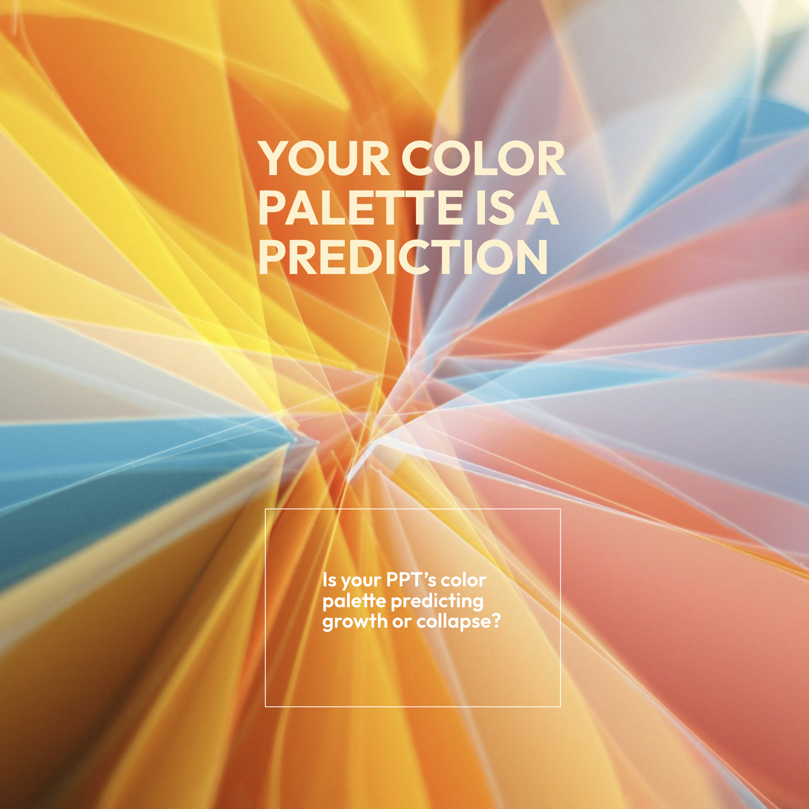
Your color palette is a financial forecast
Before you open your mouth for your next presentation, your deck already told them whether you're winning or losing.
Researchers just analyzed 12,000 European paintings from 1600–1820 and discovered that color composition predicted economic growth as reliably as satellite imagery does today.
Bright, saturated palettes dominated boom times. Muted earth tones appeared during wars and recessions. The pattern held across five countries for 220 years.
Here's the color code:
Want to signal prosperity? Use blue. Green. High brightness. Saturated color.
Signaling contraction? Use muted browns. Desaturated palettes. Low brightness. Earth tones dominate.
Now look at today's brands through that lens:
Stripe's saturated purple gradient? Prosperity signal. "We have resources. We're confident."
Figma's electric palette? Same energy. Slack's original bright hashmark said "growth mode." But watch what happened when Slack got acquired. The palette got muted. Softer purples. Less pop.
The Jaguar rebrand everyone dissed last year? They ditched the leaping cat for abstract pastels and earth tones. The internet called it "a spa logo." The color research says something sharper: they accidentally signaled retreat.
Meanwhile, Robinhood stayed electric green through every crisis. Cash App kept its bright palette when crypto collapsed. The colors said "we're still here" even when the headlines didn't.
—Now check 2025's design forecasts—
Pantone's color of the year is Mocha Mousse—a warm brown. Benjamin Moore chose Cinnamon Slate—deep plum. Design blogs are calling it "cozy" and "grounding."
The historical data calls it something else:
A contraction palette.
But there's a counter-trend. Dopamine colors. Hyper-saturated gradients. Optimistic yellows. The design world is split down the middle—half bracing, half betting on growth.
How can you use this in your next deck?
→ Frame the problem in earth tones. Muted. Serious. "Here's the challenge."
→ Shift to saturated colors for the solution. Brightness says "we have a way forward."
→ Use blue when you need trust. Green when you're talking growth.
→ If your whole deck is muted, you're accidentally saying "we're in survival mode."
A forecast for 2026?
The brands that push toward saturation now are betting on expansion. The ones that stay in earth tones are hedging.
Historically, the color shifts preceded the economic data. Artists' palettes changed before GDP caught up.
If the dopamine colors win the next 18 months, the market is pricing in optimism before it arrives.
Your deck is already making a statement.
Make sure it's the one you want.
—
Source: Colors of Growth, Boerner et al, Nov 25 2025